Neeta Khanuja

design · 2020 to 2021

a storytelling app for MEMEX

MEMEX was a European research project on social inclusion through cultural heritage. In pilots in Barcelona, Paris and Lisbon, people from migrant and marginalised communities wrote stories about places that mattered to them. The stories were pinned to locations on a map and linked to a knowledge graph of heritage sites, people and events.

The work covered the user experience and interface of the mobile app: the information architecture, the privacy model, the wireframes and the high-fidelity screens. The app had two sides. Storytellers write and place their stories; viewers find them on a map and read them.

UX and UI designer, Interactive Technologies Institute, Lisbon · with Hollie Bostock, Valentina Nisi and the MEMEX team at ITI · memexproject.eu · MEMEX was funded by the European Union’s Horizon 2020 programme under grant agreement No 870743
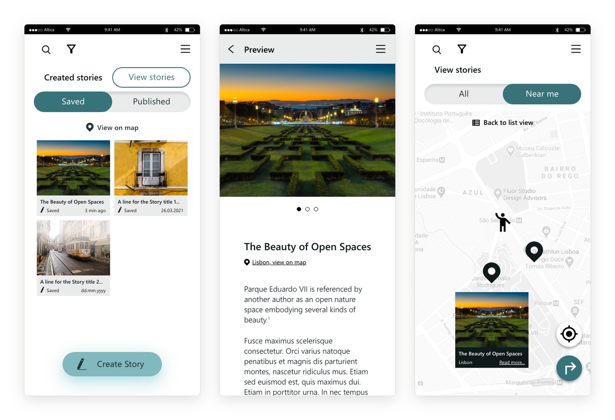
Three screens of the final design: an author’s saved stories with photos, the preview of a story about Parque Eduardo VII, and a map of stories near the reader with a story preview card.
the final interface: saved stories, a story, and stories near me
i.

twenty-seven requirements, one structure

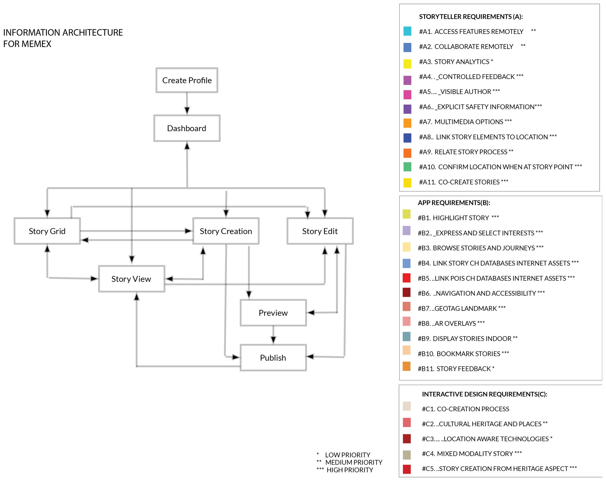
The consortium agreed on 27 requirements in three groups: what storytellers need, what the app must do, and how the interaction should work. Each had a priority from one to three. We turned the list into an information architecture with six core areas: the story grid, story creation, story editing, the story view, preview and publishing.

An information architecture diagram linking create profile, dashboard, story grid, story creation, story edit, story view, preview and publish, beside a colour-coded list of storyteller, app and interaction requirements with priorities.
ii.

every block traced to a requirement

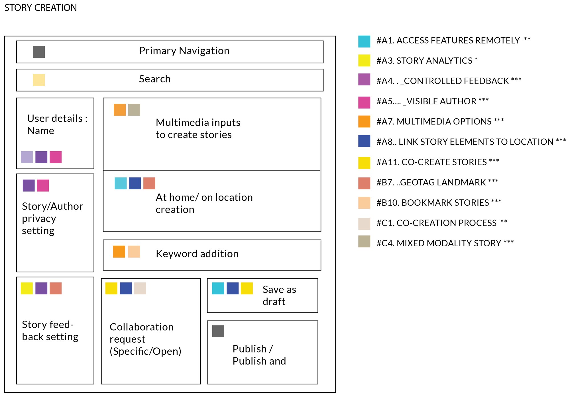
For each screen, we laid out the content blocks and marked each block with the colours of the requirements it served. Developers could see why a block was there and what it had to support. A requirement with no colour on any screen showed a gap.

Block layout of the story creation screen: navigation, search, user details, multimedia inputs, location, keywords, feedback settings, collaboration request, save as draft and publish, each block marked with coloured squares matching requirement codes.
the story creation screen, mapped to its requirements
iii.

three versions

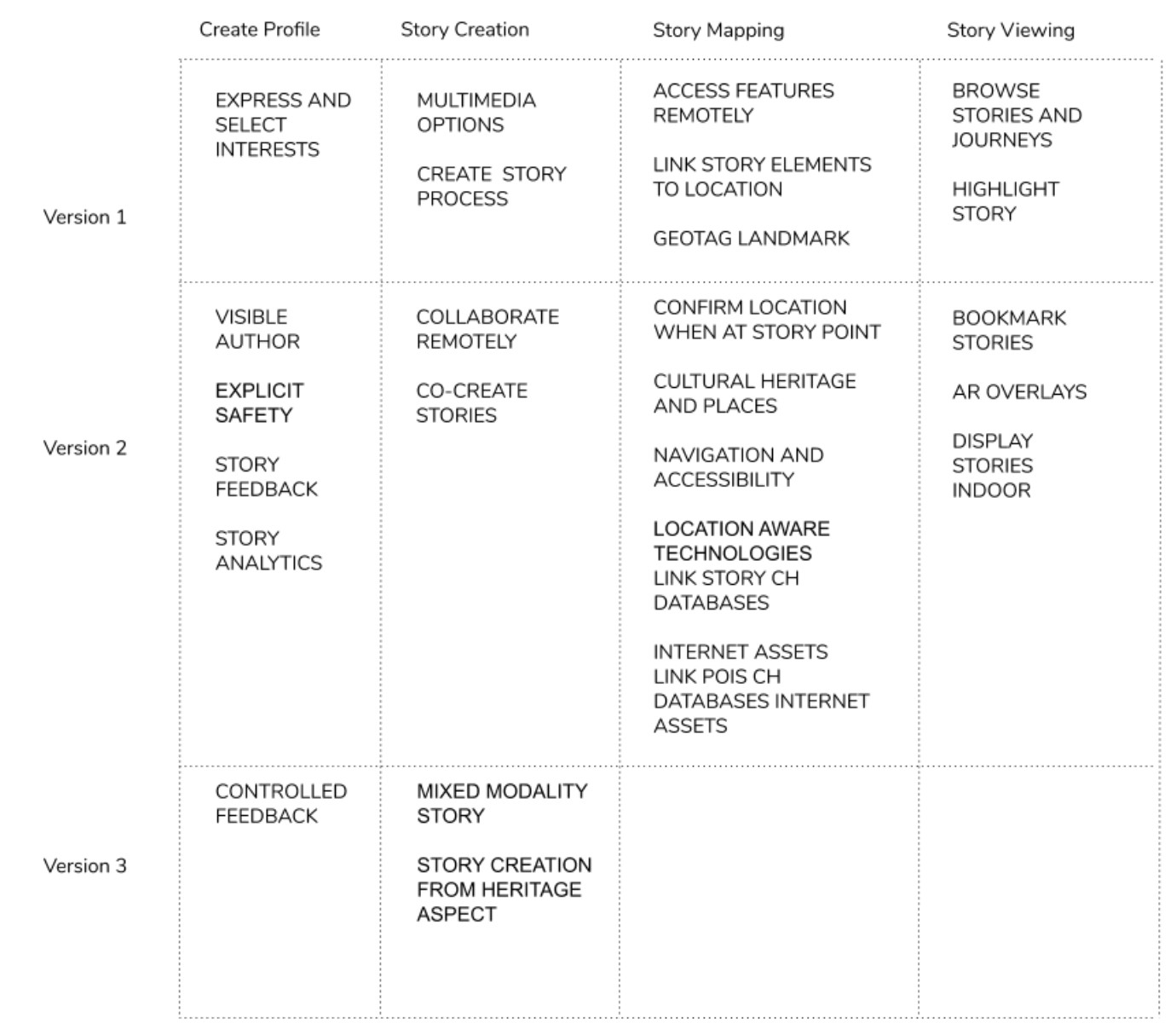
With Hollie Bostock, we sorted the requirements into three releases across four parts of the app: the profile, story creation, story mapping and story viewing. Version 1 held the core: interests, multimedia stories, stories tied to a location, and browsing. Version 2 added collaboration between authors, safety settings, analytics, AR overlays and stories shown indoors. Version 3 added controlled feedback and stories that mix media with AR. We wireframed each version so the consortium could see what each release would contain.

A table of features by version and by part of the app: create profile, story creation, story mapping and story viewing, for versions 1, 2 and 3.
features by version, June 2020
iv.

a dashboard for authors

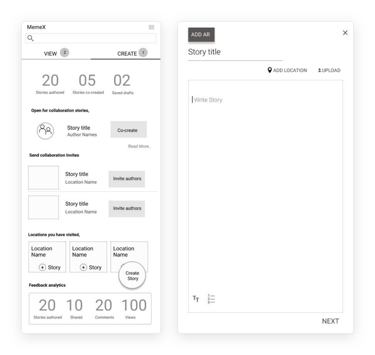
In the version 2 wireframes, an author’s dashboard showed the stories they had written, co-created and saved, invitations to write with others, places they had visited, and simple feedback numbers. Writing a story started with a title, a location, media and an option to add AR.

Two version 2 wireframes: an author dashboard with counts of stories authored, co-created and saved, collaboration invites, visited locations and feedback analytics; and a write story screen with add AR, add location and upload.
version 2: the author dashboard and writing a story
v.

three levels of sharing

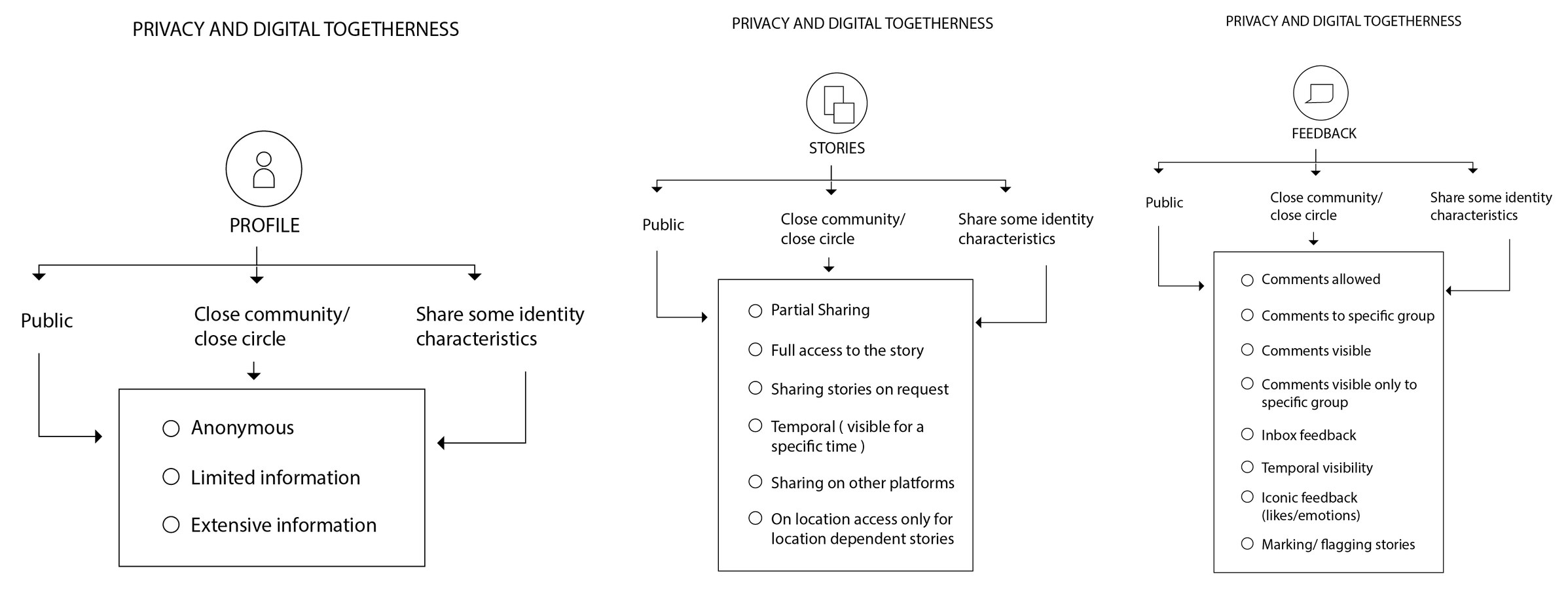
Many storytellers were migrant women sharing personal memories, and some did not want to be identifiable. We designed privacy as a choice a person makes for each part of the app. A profile could be anonymous, limited or detailed. A story could be shared in part, on request, for a limited time or only at its location. Feedback could be open, limited to a group, or turned off.

Three diagrams titled privacy and digital togetherness, for profile, stories and feedback. Each splits into public, close community and sharing some identity characteristics, and lists the options available.
vi.

forty-six screens

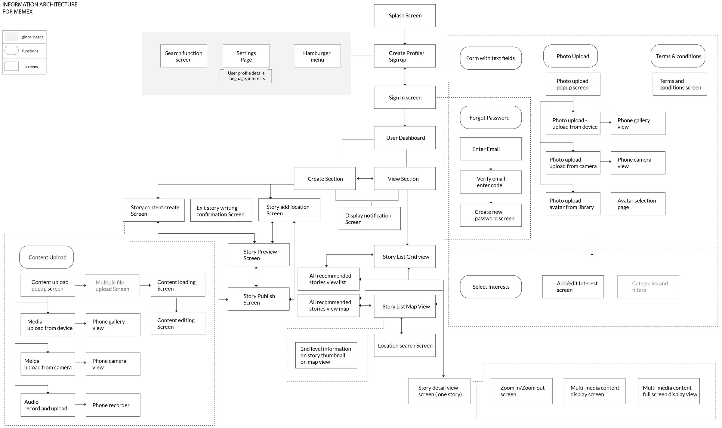
The full architecture covered sign-up, photo upload, interests, the dashboard, story creation with media, and story viewing in a grid or on a map. We wrote an index of all 46 high-fidelity screens, with the actions on each, so the technical partners could estimate the work.

The full information architecture of the app: splash screen, sign in, profile, dashboard with create and view sections, and their screens for media upload, preview, publish, story list, map view and story detail.
vii.

the first full release

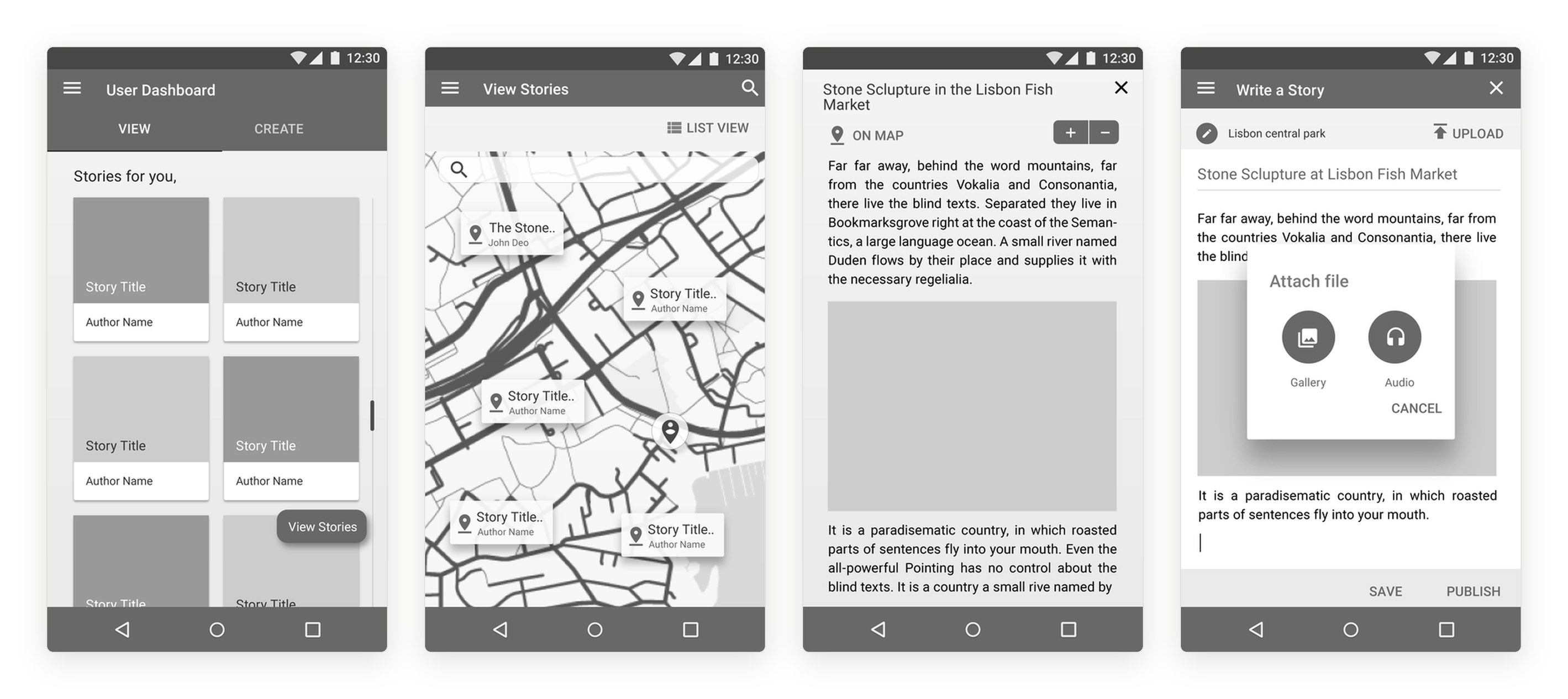
The first high-fidelity screens followed Android conventions. A dashboard held the stories a person had saved and published. Stories could be browsed as a grid or on a map, and each story opened onto its text, media and location.

Four grey Android screens: a dashboard of saved stories, a map with story pins, a story detail page about a stone sculpture at the Lisbon fish market, and a write-a-story screen with media.
viii.

simpler, after the partners

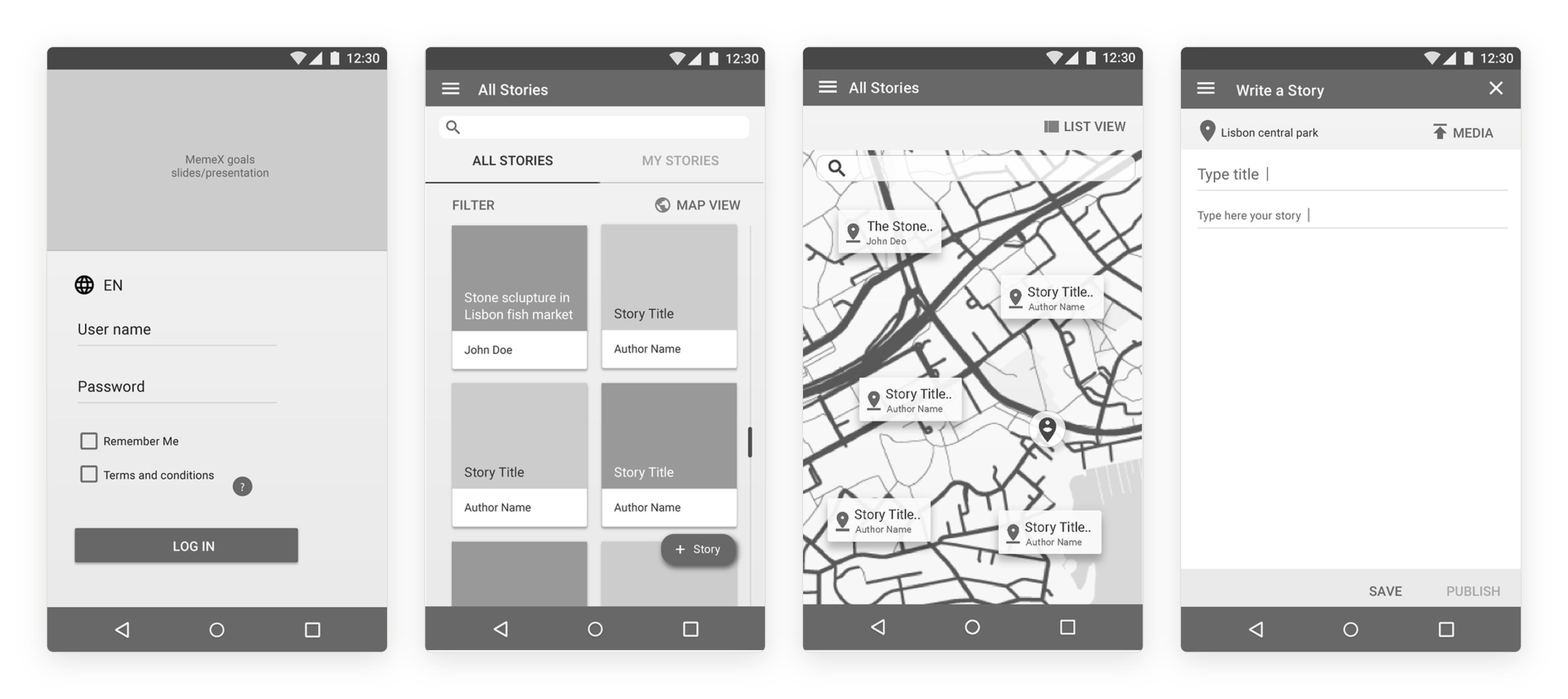
Meetings with the technical and social partners cut the second release down. We split users in two. Anyone could open the app as a viewer and browse anonymised stories, without an account. Only the pilot facilitators could log in to write stories. Comments and likes were removed, to protect storytellers from harmful feedback. The dashboard went, and the app opened straight onto the stories.

Four screens of the second release: a login for facilitators with a language choice, a list of all stories, the same stories on a map, and a plain write-a-story screen with save and publish.
the second release: login for facilitators, stories as a list and a map, and writing a story
ix.

writing with suggestions

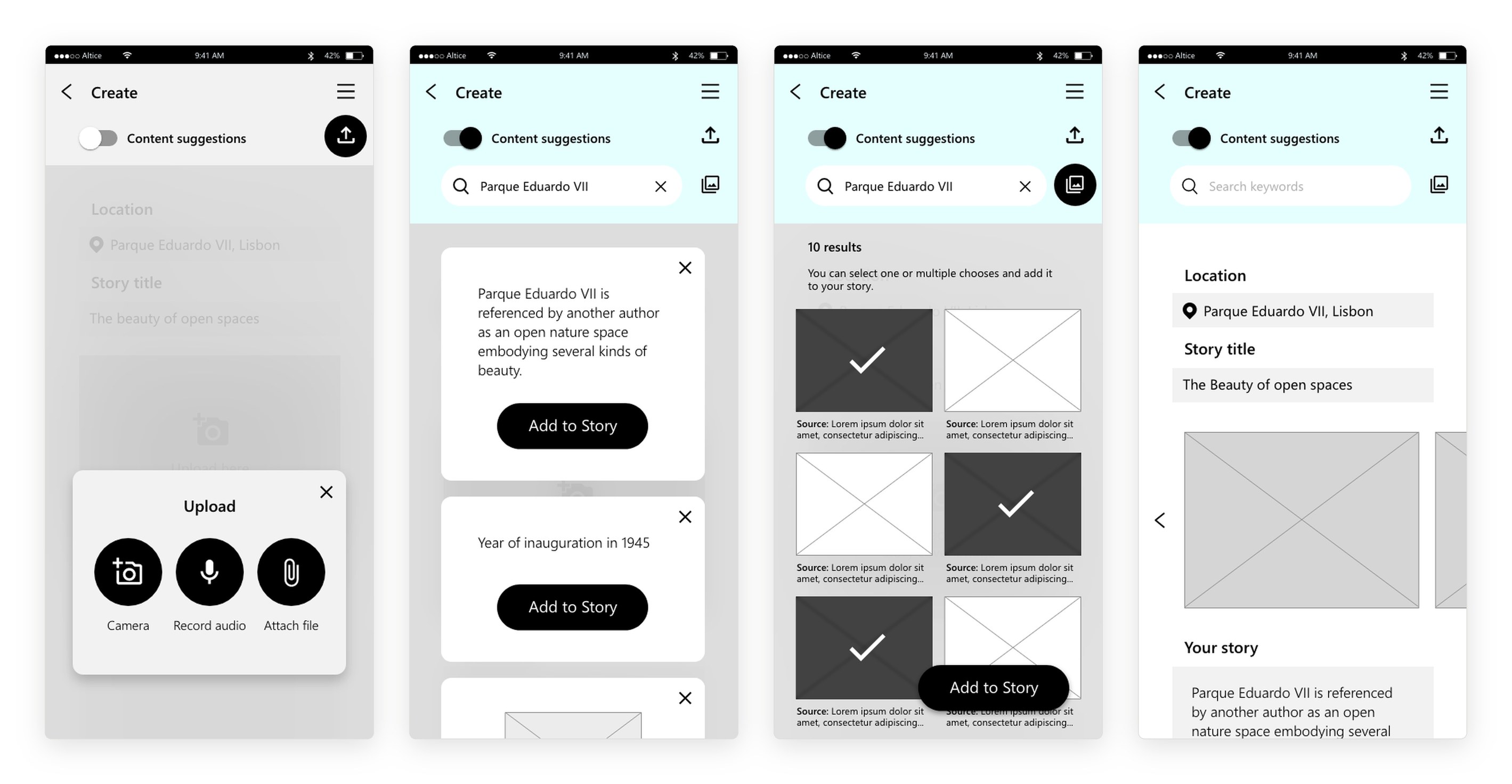
Writers add photos, audio recordings or files through one upload button. The knowledge graph linked each story to people, places and heritage records. For storytellers, the graph became a source. With content suggestions turned on, a writer searches for the place and the app offers facts, images and other authors’ references to it. The writer chooses what to add: a fact appears in the story text, and chosen images join a carousel above it.

Four screens: an upload popup offering camera, record audio and attach file; suggestion cards for Parque Eduardo VII with add to story buttons; a grid of suggested images with three selected; and the story with the added fact and an image carousel.
x.

placing a story

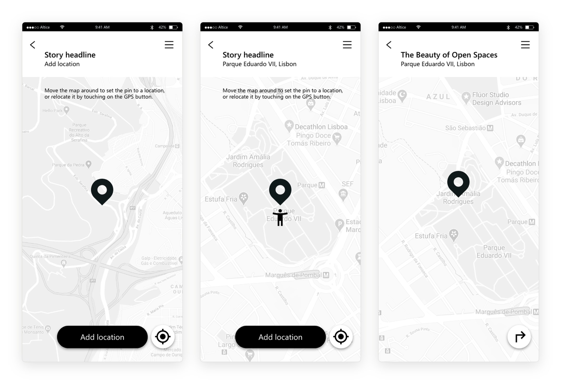
A writer places the story by moving the map under a fixed pin, or jumps to where they stand with the location button. Readers see the story on the same map and can ask for directions to it.

Three screens: an add location map with a pin and instructions, the pin set on Parque Eduardo VII with the writer’s position, and the published story on the map with a directions button.
xi.

keywords, preview, publish

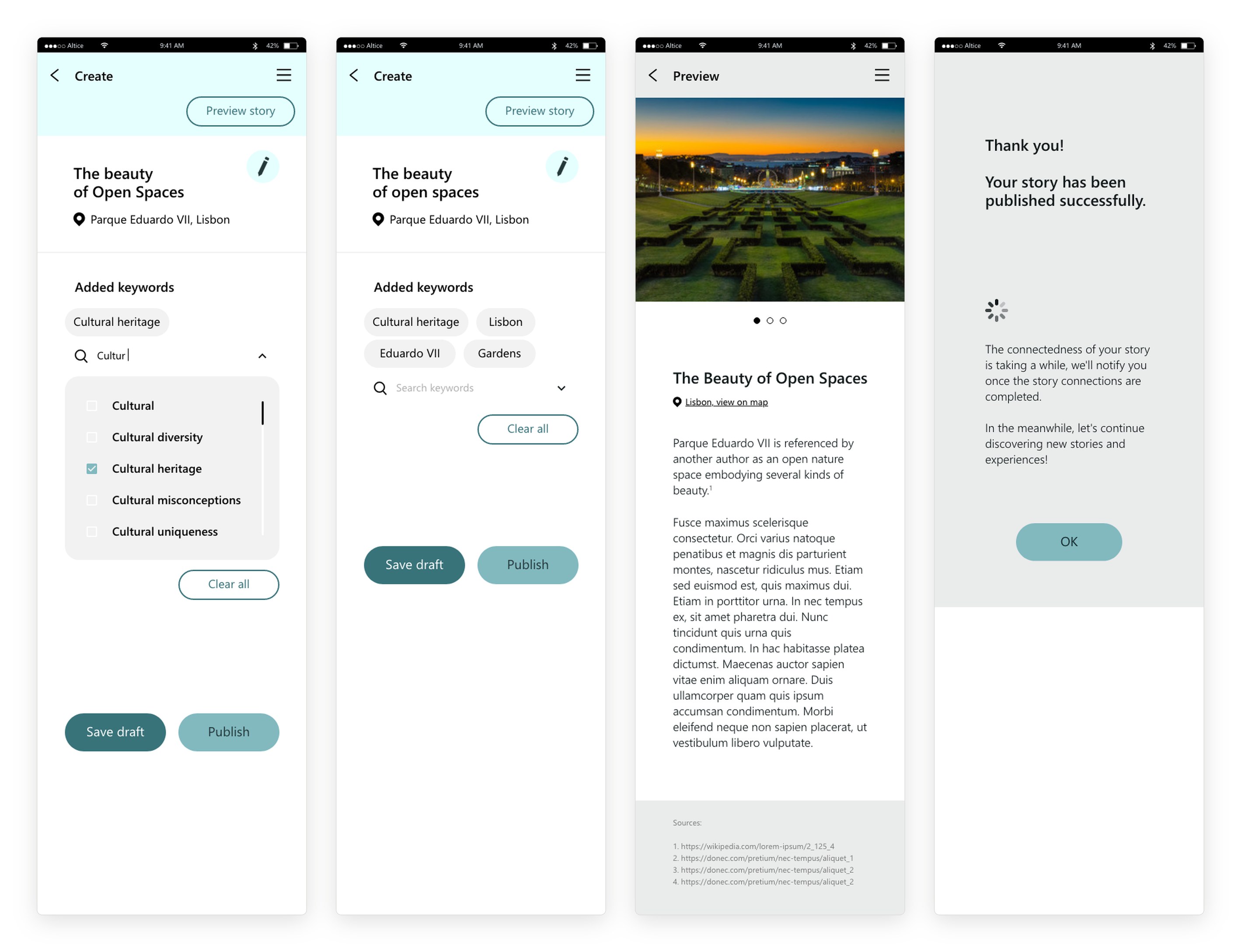
Before publishing, the writer adds keywords from a shared vocabulary, ticked from a list that narrows as they type. The keywords are what the knowledge graph uses to link stories. Publish stays inactive until at least one keyword is added. The preview shows the story as readers will see it, with numbered sources for any facts taken from the suggestions. After publishing, a message explains that the story’s connections take time to compute and that the app will send a notification when they are ready.

Four screens: a keyword list narrowed to words starting with cultur, with cultural heritage ticked; four added keywords with the publish button active; a preview of the story with a photo carousel, text and a list of sources; and a thank-you message saying the story’s connections will be ready soon.
xii.

stories that connect

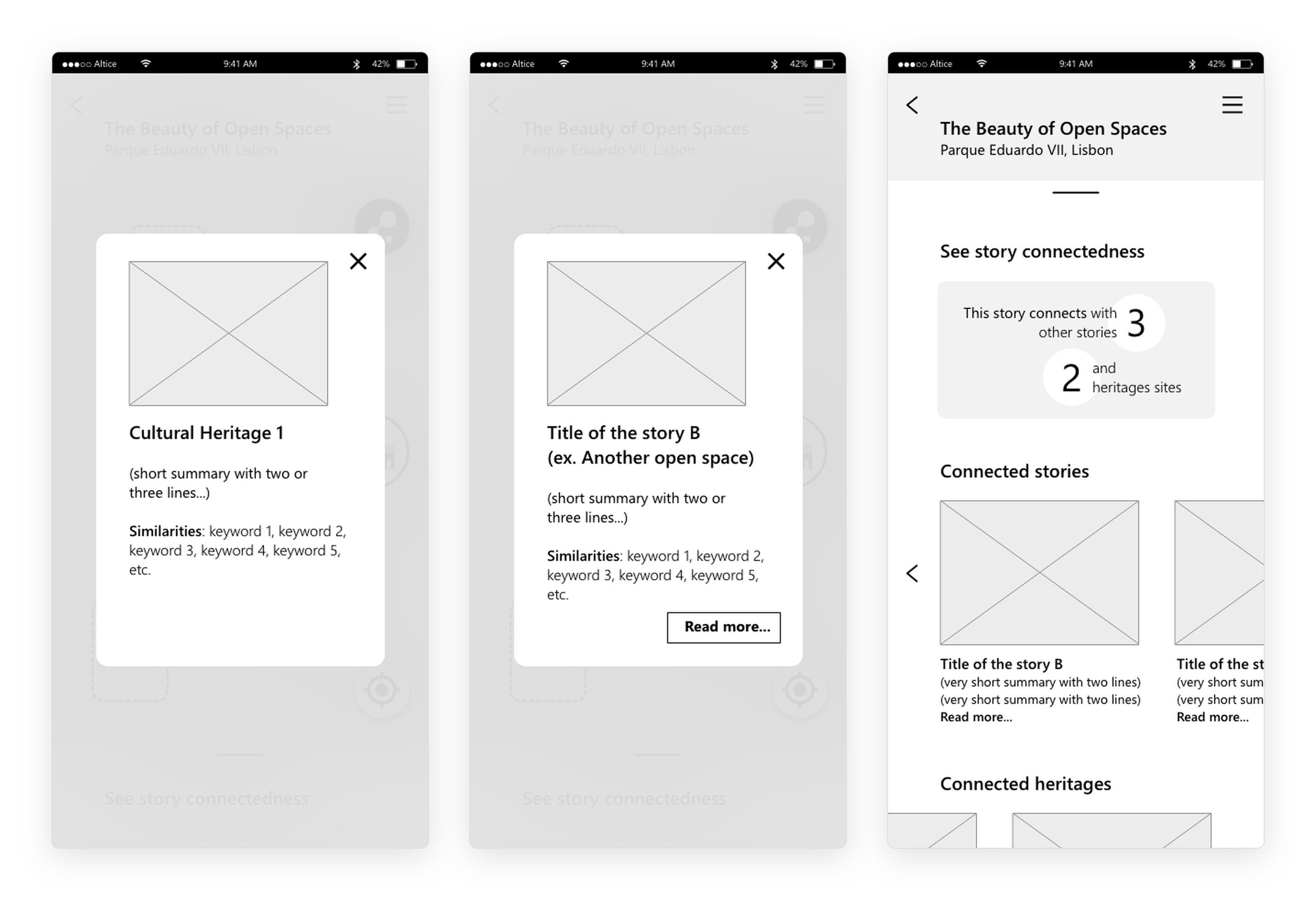
From a story’s map, the graph button shows what the story connects to: other stories and heritage sites, drawn as a small network. Tapping a node opens a summary with the keywords the two share. Scrolling up gives the same connections as lists: how many stories and sites, and cards for each.

Three screens: a popup for a heritage site with its shared keywords, a popup for a connected story with a read more button, and a page counting three connected stories and two heritage sites with cards for each.
xiii.

browsing stories

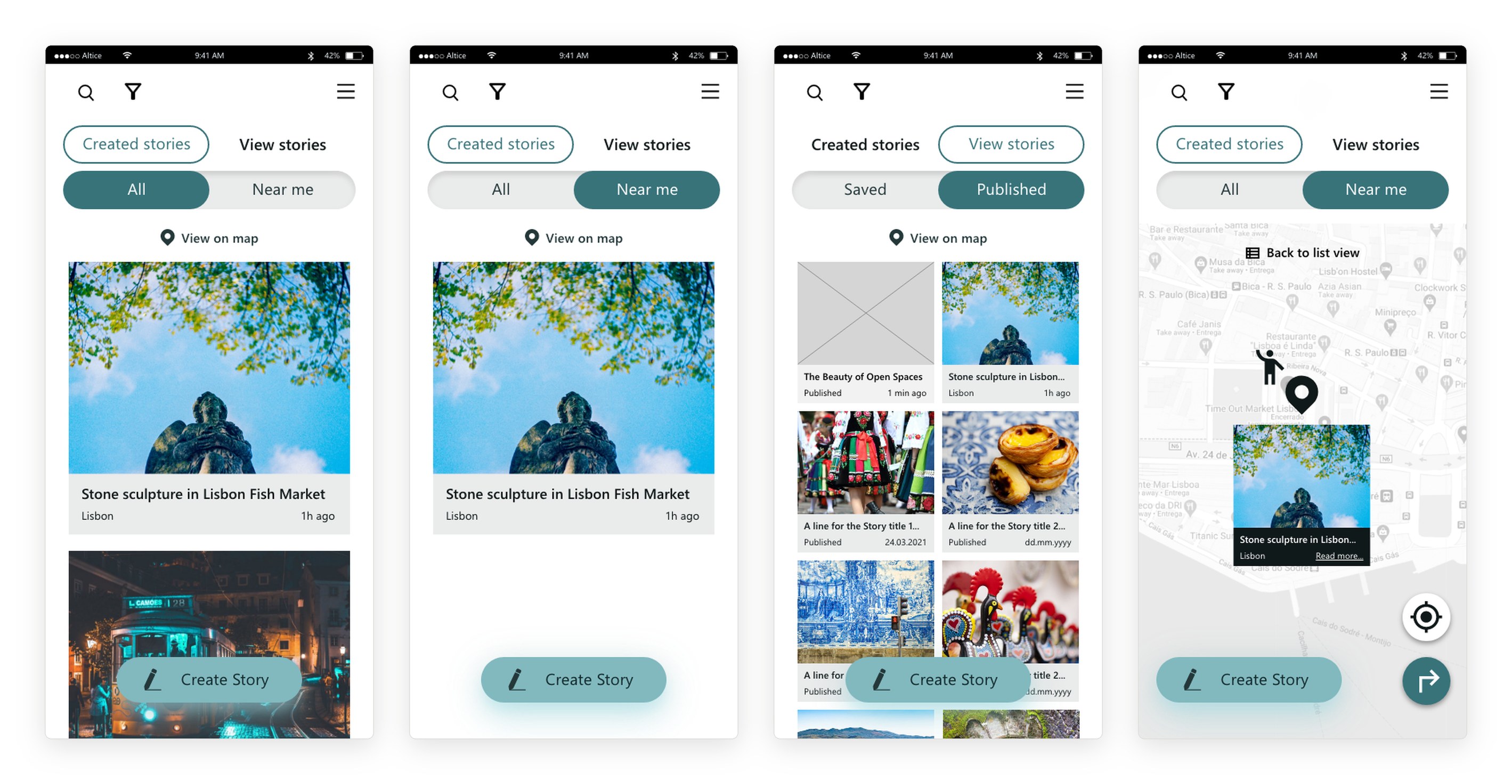
Two switches organise the app. Readers choose between all stories and stories near them. Authors choose between their saved drafts and their published stories, and a new story appears at the top once it is published. Each list can also be opened on the map, with the reader’s position marked. Tapping a pin shows the story’s photo and title, with directions to the place. The app runs in English, French, Portuguese and Spanish.

Four screens: all stories with large photos, stories near me, an author’s published stories in a photo grid with a new story at the top, and a map of stories near the reader with a story preview and a directions button.
xiv.

a style guide for the build

We wrote a UI style guide in Adobe XD for the developers. It set a teal colour scheme, a type scale in Segoe UI, a 4:3 ratio for landscape photos, and every state of the main components: buttons, the expandable search bar, the create story button, and the switches between saved and published, and between all stories and stories near me.

Primary#38737A
Primary variant#81B9BF
Secondary#B2EBF2
Secondary variant#E5FFFF
Complementary#EAEBEB
Background#FFFFFF
Notifications and errors#E70A04
On secondary#10191A
  • H1Segoe UI · Semibold · 20px
  • H2Segoe UI · Semibold · 18px
  • H3Segoe UI · Semibold · 16px
  • H4Segoe UI · Semibold · 12px
  • Subtitle 1Segoe UI · Regular · 14px
  • Subtitle 2Segoe UI · Regular · 11px
  • ButtonsSegoe UI · Regular · 20px

the colour scheme and type scale, as specified in the style guide